I struggle on where to start. Should it be the pure terror that is/was Pierre the Pelican or the recency of the Tampa Bay Buccaneers wearable alarm clocks or something more innocuous? For the sake of keeping you the reader within the realm of the current, we'll start in Cigar City.


It appears that Tampa now has anther AFL team judging by the ultra-busy amateurish style of the getup. I was hoping to type a few more sentences before addressing the numbers but I am just postponing the inevitable. Yes, they look like a 1980's digital alarm clock as well as the dashboard display of my 1994 GMC Jimmy and this facet has been touched on quite well by the media. I especially love the endearing renditions such as this GIF, third image down. Precisely the type of fan engagement that this team probably does not want but nonetheless gets spread across the Internets like the seeds of a dandelion scatter to the winds. Frankly had this one bold detail been omitted, the uniform redesign would have been overlooked and forgotten in 3 days given the team's current level of relevancy. From a design-based perspective, I cannot begin to understand what motivated this choice. The Buccaneer, a pirate of the Caribbean and the Gulf, is a part of a culture typically associated with organic lines accented by sharp points. Simply put, an appearance of edgy dishevelment with a waft of 17th century European high-class. I imagine similar ideals were considered within the minds of the design team as they approached this important rebranding. In fact, I love the new flag logo and typeface logo.
 I believe it was executed perfectly in respect to this culture. The letters have a proper, rectangular shape that present a far more refined evolution of the previous logo sort of like a dirty, torn-tunic-adorned deckhand elevating to the stolen-fine-clothes glamour of a pirate lord. BUT THOSE NUMBERS! I cannot fathom where the hard edge lines-through-the-corners, digital revolution numbers came from. Not an ounce of that fits the style that the emblem, font, and even the rest of the uniform with the pirate ship alternate logo has set. I does not even have an Oregon Ducks risky vibe; it is just weird. Whether this was a choice made by Nike or the Bucs office, I do not know, but the alarm clock comparisons will last for a very long time. I cannot wait to hear what Jon Gruden says the first time these babies hit the turf.
 One more redesign, more accurately 'new design', that's near and dear to my heart is this 2013 iteration of the beautiful, white, English Bulldog representing my University of Georgia. I must say, that despite my initial dislike of this corporatized, Nike-ish (there might be a trend here) dawg, I have grown to like and accept its rigid but elegant proportions. I also must quote logo-centric design site Brand New on "The above versions of the bulldog, used in the past, are still listed as acceptable. Which seems weird and counter-intuitive to the whole process of consistency. I doubt any of these will last long." in reference to the old-style head on the left of the comparison as well as every other iconic UGA marks that represent different eras and styles and thus will never become irrelevant. It's tradition. However, I must mention that the use of the oval G in the collar of the new bulldog is awkward and unfitting due to the thin red stripe that exists in the oval G already and fails to match the proportions of its placement location. But that is just my opinion. This style change is far Think of this quick discussion a palette cleanser for the haunting subject matter coming next.
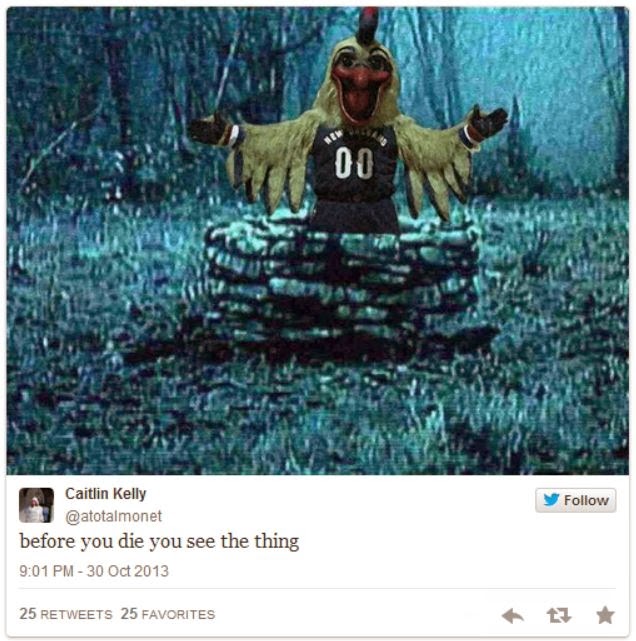
Pierre the Pelican. The most frightening sports mascot you will ever see (actually that might be false as I will prove later on). It's blood-red beak, luring tongue, unnaturally-yellowed feathers. If you did not dislike clowns before... Great job by the New Orleans Pelicans to take his debut picture as shown above in a pipe-filled back hallway where:

This "fowl" creation has been my most favorite social media fodder in recent memory. It gets so much better when fan's decide to challenge this horrified Tweeter's statement. I mean, take your pick:


And then my favorite original and remix of all time:

The sheer terror shown by this child speaks to the reality of Pierre. It wants to eat children. It is in fact the boogeyman who lived under your bed when you were 5, except now you will think it is back because it is REAL. The New Orleans Hornets made an excellent redesign to become the Pelicans, I might add, as the bird symbolizes the rebirth of the wetland ecosystem that weathered Katrina and BP as well as the franchise that weathered the Chris Paul trade. Yet unfortunately the bird that rose again was a 7,000 year old Sumerian god of death here to consume the firstborn. Luckily, for the general populace of the United States and Louisiana, who I assume is used to Hoodoo magic (it's OK, I have a Cajun friend named Todd), Pierre saw a "plastic surgeon" about that nose as the basketball team presented in this video (really did not help make things less creepy). But here it is; a lot softer on the eyes and soul:
 That's a lot better.
But, please continue.
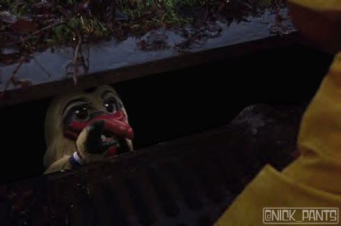
NOW THERE'S THIS

Yea, the New Orleans Pelicans are just really, really bad at this thing. I'll give you the written equivalent of dropping the microphone and leave the conversation with this. Thanks for surviving; I am sorry for the ensuing nightmares.

It appears that Tampa now has anther AFL team judging by the ultra-busy amateurish style of the getup. I was hoping to type a few more sentences before addressing the numbers but I am just postponing the inevitable. Yes, they look like a 1980's digital alarm clock as well as the dashboard display of my 1994 GMC Jimmy and this facet has been touched on quite well by the media. I especially love the endearing renditions such as this GIF, third image down. Precisely the type of fan engagement that this team probably does not want but nonetheless gets spread across the Internets like the seeds of a dandelion scatter to the winds. Frankly had this one bold detail been omitted, the uniform redesign would have been overlooked and forgotten in 3 days given the team's current level of relevancy. From a design-based perspective, I cannot begin to understand what motivated this choice. The Buccaneer, a pirate of the Caribbean and the Gulf, is a part of a culture typically associated with organic lines accented by sharp points. Simply put, an appearance of edgy dishevelment with a waft of 17th century European high-class. I imagine similar ideals were considered within the minds of the design team as they approached this important rebranding. In fact, I love the new flag logo and typeface logo.
One more redesign, more accurately 'new design', that's near and dear to my heart is this 2013 iteration of the beautiful, white, English Bulldog representing my University of Georgia. I must say, that despite my initial dislike of this corporatized, Nike-ish (there might be a trend here) dawg, I have grown to like and accept its rigid but elegant proportions. I also must quote logo-centric design site Brand New on "The above versions of the bulldog, used in the past, are still listed as acceptable. Which seems weird and counter-intuitive to the whole process of consistency. I doubt any of these will last long." in reference to the old-style head on the left of the comparison as well as every other iconic UGA marks that represent different eras and styles and thus will never become irrelevant. It's tradition. However, I must mention that the use of the oval G in the collar of the new bulldog is awkward and unfitting due to the thin red stripe that exists in the oval G already and fails to match the proportions of its placement location. But that is just my opinion. This style change is far Think of this quick discussion a palette cleanser for the haunting subject matter coming next. |
| (cue Halloween theme) |
Pierre the Pelican. The most frightening sports mascot you will ever see (actually that might be false as I will prove later on). It's blood-red beak, luring tongue, unnaturally-yellowed feathers. If you did not dislike clowns before... Great job by the New Orleans Pelicans to take his debut picture as shown above in a pipe-filled back hallway where:
This "fowl" creation has been my most favorite social media fodder in recent memory. It gets so much better when fan's decide to challenge this horrified Tweeter's statement. I mean, take your pick:
And then my favorite original and remix of all time:
The sheer terror shown by this child speaks to the reality of Pierre. It wants to eat children. It is in fact the boogeyman who lived under your bed when you were 5, except now you will think it is back because it is REAL. The New Orleans Hornets made an excellent redesign to become the Pelicans, I might add, as the bird symbolizes the rebirth of the wetland ecosystem that weathered Katrina and BP as well as the franchise that weathered the Chris Paul trade. Yet unfortunately the bird that rose again was a 7,000 year old Sumerian god of death here to consume the firstborn. Luckily, for the general populace of the United States and Louisiana, who I assume is used to Hoodoo magic (it's OK, I have a Cajun friend named Todd), Pierre saw a "plastic surgeon" about that nose as the basketball team presented in this video (really did not help make things less creepy). But here it is; a lot softer on the eyes and soul:
That's a lot better.But, please continue.
NOW THERE'S THIS
Yea, the New Orleans Pelicans are just really, really bad at this thing. I'll give you the written equivalent of dropping the microphone and leave the conversation with this. Thanks for surviving; I am sorry for the ensuing nightmares.
No comments:
Post a Comment