The toaster in my parent's kitchen, which I used frequently over the Christmas Break, is a Black & Decker. The cordless drill I remember my father using so often was a Black & Decker, cloaked in its traditional black and orange. In fact, I believe our iron is a Black & Decker. This is not really any form of brand loyalty, but more likely a purchase history based on good quality and low price. In fact, my father was loyal to Craftsman, and now Husky, when it comes to tool manufacturers. This may even serve as an air of proof that the quality of Black & Decker was declining. The change in public image of B&D seems to be less about dubious power tool quality, but more dilution of the brand. The company slowly bloated the value of its brand image and logo by producing a myriad of kitschy, cheaply-made products, some of which were actually manufactured by a third party. It essentially lost all of its credibility as a high-quality tool maker. Fortunately, rebranding and refocusing projects exist. I love a rebranding more than any other news story because it allows me to pick apart design and meaning. I will expound more upon this past-time in later posts.
Black & Decker hired brand consultancy company Lippincott to facilitate the metamorphosis into Black + Decker. The new B+D announces itself as a utilitarian-yet stylish-product company that appeals to makers, hobbyists, and the general person rather than a specific set of carpenters or construction workers. The entirety of the brand’s new design language focuses on a simplicity of form where products are built as necessity would dictate. This refocusing of appearance can be compared to the well-used benchmark of the iPhone. It's introduction in 2007 brought amazing new technology in a sleek, refined, and simple package. The new power tools to be produced offer a beautifully engineered form expressing the essential angles of construction and packing high-tech, possibly innovative features. For example, the standard cordless drill contains a gyroscope to assist the user in balancing the tool during a drilling motion.

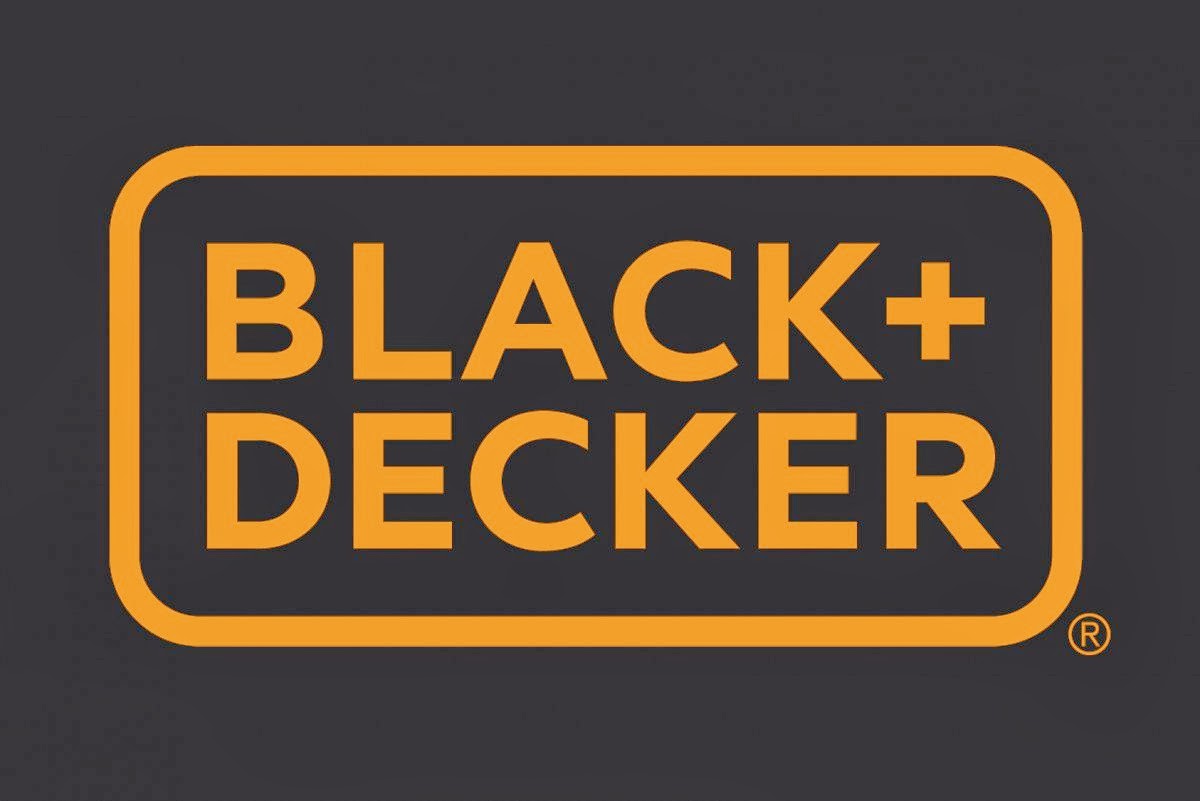
The new logo is simple and is meant to only focus on the name without distracting from the product. It embraces a single color approach as to make it readable and appropriate in any application. It goes without saying that the new "Black + Decker" fits within our cultures current love of flat, simple logos with big, readable typefaces. By no means is this bad; I love it. In defense of this point, I get to reference the title of my blog: "Simplicity Is The Ultimate Sophistication". I lifted that statement from Leonardo Da Vinci, who was more or less the preeminent "designer" around 500 years ago. This sort of design is timeless and, given the unique target-market-focus yet to be seen from a mainstream tool company, I am very excited to see a rebirth from a once quintessential American brand.
Here are a few links for information from more-learned journalists:
No comments:
Post a Comment