Tuesday, April 15, 2014

Teaching History By Making It Up

Over the past 7 years or so, there has been a small but successful trend of developing narratives that fit snugly into several decades worth of historical timelines and major events. Currently Marvel and 20th Century Fox are attempting to viralize the setting of its half-century spanning X-Men: Days of Future Past. Given that the current incarnation of the franchise exists in an accurately-alternative timeline, from the 60's to well ahead of the present, the depth of world happenings to play around with is at Marianas Trench levels. For instance, we have Vietnam, the Cuban Missile Crisis, President Kennedy's assassination, the Cold War in general, Watergate, Chernobyl, Apartheid, the Zapatista Rebellion, and so on. Therefore, the marketing team for the film have attempted to capitalize on every possible opportunity.

The first and easiest conspiracy to mine out is always going to be the assassination of John F. Kennedy. Given the bizareness of existing theories, it is not to hard to incorporate the interference. What really happened on November 22, 1963 was that the fellow on the grassy knoll was actually Erik Lensherr (Magneto) bending Lee Harvey Oswald's missed gunshot into the motorcade. This gives birth to the "Bent Bullet Theory" which has been thoroughly documented in video and classic press-release style article on its own website. The shooting, of course, occurring only a year after Lensherr and the other mutants semi-dissolved the Missile Crisis. However, the Bent Bullet is only one of the 25 Moments that will be slowly unveiled leading up to the films premiere. In addition, there is this fantastic anti-mutant propaganda site from the fictional super-corporation Trask Industries.

The intent is blatantly to generate a buzz around Days of Future Past by fans and consumers virally sharing these psuedo-historical videos and news clippings in order to better understand the cultural relevance of the films happenings. I absolutely fall for this type of strategy because I like to think of myself as a little bit of a history buff and it helps me immerse myself further into an already engaging story. The Assassin's Creed video game mega-franchise has built its entire existence around this concept; in short, the Assassin and Templar orders have been fighting since pre-ancient Rome and literally are behind every war, invasion, religion, etc. Michael Bay's C4-fueled, undying Transformers series has also tapped into a similar vein of  history intervention. The whole point of the moon landing was to beat the Russians to investigating an alien (Autobot) spaceship crash-landed on the floating rock.
Tyrion Lannister & Tricky Dick
The most fascinating and eye-catching part of these attempts is when the given production company seeds a modern actor or actress into a vintage image or video and gets the film grain and sepia toning just right. It is almost beautiful. Take the picture of Peter Dinklage, on the right, discussing mutant extermination with good ole' Dick Nixon. It just feels so much more real.

Aside from the sheer visceral attractiveness of melding fictional storylines into relatively accurate portrayals of world history, that we get with the svelte Assassin's Creed or the nihilistic Transformers joyride, or even Bubba Gump (!), there is an educational undertone, whether intentional or not. While I am making this assumption from my own point of view, I am also assuming there are others in the same boat as me. I play the Assassin's games, not because I can kill whoever I want, but because I get to explore a meticulously-crafted, period-piece of a stunning location, be it Renaissance Rome or (coming soon) Revolution-era Paris. Whether you paid attention in high school history or not, it is not very hard to dig into a plot such as any of these and try to discern what is absolutely true and invented. It is fun to learn a lot of little interesting things that you did not know or forgot.

Tuesday, April 8, 2014

Bringing It Back


Why the old is new and design always comes full-cirlce.

People like to say that history always repeats itself, and in many cases, its true. Artists find their best inspiration in the past. Take the Neoclassical Movement for example where the painters, sculptors, and architects found a fashionable 'vintage' in the old Hellenic world. This is still practiced to an extent in the South; the antebellum period made extensive use of fluted, Grecian columns, and that period is now a past re-inspiring the present smooth-column, Roman/Greek composite architecture used around all sorts of important and perceptibly opulent buildings in government, academic, or private settings. Product design feels the same cyclical renaissance.
The most current trend (I personally don't think it's a trend) is flat design. Every digital company is embracing it to compete with the visual appeals of their rivals. Facebook looks flat, Twitter looks flat. Of course, the most notable and controversial implementation of the style is Apple's iOS 7. Regardless of opinion, this flat style is nothing new. Its roots are based in the Helvetica-fied Swiss style of the 50's. The look is focused completely around the elegance of the Helvetica typeface which lends itself to the use of simple color fields and a flat appearance.
The present era of the 2010's is starting to see more and more design influence from our parent's and grandparent's past. This also goes for the design of cars, cameras, clothes, sunglasses, coffee-makers, refrigerators, you name it. Maybe the reason us millennials embrace the throw-back so fervently is because of the simplicity it recalls. These decades had no laptops, smartphones, mobile connectivity, or anything of the sort. Yet everyone and everything looked great. Or maybe it is just because trends change with time and what is currently in vogue happens to look retro. I was greatly inspired to by an article from The Verge develop my thoughts on the concept in this post. It collected a wide variety of examples from the newest generation Mini Cooper to Nikon's vintage, metal-encased camera line. Much of the reason consumers want a retro-looking digital SLR is due to the trendy obsession with film photography, something which I am party to. With the renewed cultural affinity for the grain of the film, comes an attraction for the antique camera and therefore the cameras with the modern guts get renovated with a vintage body.


In addition to the neoclassical Mini, the Ford Mustang has also been re-engineered for 2015 with a flavor from the past. The old-look 'Stang first debuted in 2005 as the first of the retro pony car movement that resurrected the Camaro and the Challenger with boxy front and back ends. This newest generation also brings into the equation the oh-so-desirable fastback glass of '69 for an even more old-school style.
Of course these little nostalgic details are juxtaposed with the modern accouterments of LED lighting and rear-diffusers. It is this synthesis of today's high-technology and yesterday's smooth, classy lines that creates the current chic of the millenial era. A wonderful, recent pop-culture example is the phone/handset used by Joaquin Phoenix in Her. It is clamshell-flip-smartphone, similar to the way the Samsung Note II has an attached cover. Rather than design a highly-futuristic, glass-thin wafer of a phone, director Spike Jonez and designer K.K. Barrett opted to retrofit an old, slim cigarrette case. The finished product echos the form and colors of 1950 in a thin rectangle surrounding a high-end touchscreen interface.

Tuesday, March 25, 2014

Through a Glass, Darkly

“For now we see through a glass, darkly; but then face to face” is the King James Version of a segment of 1 Corinthians 13:12. The verse is intended to address our human ideas of what is to come and what awaits in our collective future. The “glass”, or more accurately translated as a mirror, reflects our individual image and is, in essence, an imitation or unreal image. Our foresight is just that, and we will only see the future in its true form when it is the present. In popular culture, we adore depictions of future cultures with robust artificial intelligence, sophisticated robotics, flying automobiles, simplified space travel, Apple-esque, sterile utopias, and dark, dangerous, dystopian mega-cities. Science fiction is a beautiful example of an ever-evolving, subjective literary and film genre. Design is its most subjective aspect. Sure, a lot of the sci-fi movies that Generations X and Y have grown up with tend to show everybody wearing bland Nehru jackets and living in a shiny, cookie-cutter society, but as our cultures have drastically changed from the 1960’s to the 2010’s, so have each era’s respective visions of the future. More and more future-visions produced today in art and film keep plenty of elements grounded in the present. Of course, this is not a rule across the board, but it is a trend that I will discuss later. This expose is inspired by a great article from The Verge that chronicles the evolution of “cyberpunk” in visual and written arts. In no way am I attempting to argue one form of the future; they are all different distances from the time period that I am typing in but, nonetheless, will be presented in such an order. I would rather like to explore the design and the trends of these styles and the way each style makes our society feel as well as what real-world situations are comparable.


I am an artist; I draw, paint, and create digital design. As a kid and as an adult, my favorite things to draw are robots. I am fascinated by building a simple form out of intricately-designed parts and a basic understanding of human physics. The first real, non-cartoon movies I remember watching were Star Wars, probably around age 4-6. I had/have an animatronic C-3P0 and R2-D2 piggy bank; I guess that is the reason I like robots. Those two droids are widely considered the most iconic, well-designed robots in the history of cinema. Therefore they are a standard from which to pull design inspiration. The late Ralph McQuarrie orchestrated all the design of the original Star Wars trilogy and is a legend for that. For myself and many others, 3P0 and R2 were a phenomenal segue into the realm of science fiction design. This community has developed a huge following through social media. The style, or school if you will, of design discussed in the Verge article is labeled as "cyberpunk". It is best described as a growth of sci-fi art and design into a more minimalist, polished form. Groups such as the Shinobi Gang or Neuromancer mass-blog about a myriad of different designs and art forms curated from across the internet or made in-house. Many of its members are graphic designers who contribute to sci-fi film design. One of whom, the Otaku Gangsta, has over 13,000 Tumblr followers. I follow him more for inspiration than anything. This mutual sharing of styles is enabled by social media and is essentially a great crowdsourced form of art education. As such the skilled designers behind cinema's great sci-fi epics started out admiring their predecessors. Every designer has his or her own styles, and much of their work on a given project can be influenced by the project's purpose or even a societal insecurity. In this way, design is a social commentary and, for the purposes of my writing, it can be focused around perceptions of the future.


‘The Future’, in mental images drawn from movies, posters, video games, and so forth, is often presented a being drastically different from our present. Insanely high-tech societies that usually appear in a dichotomy of really pleasant or absolutely miserable. Whether it is the clean, gilded setting of an Isaac Asimov robot novel or anything from a Terminator movie, the future is bizarre. A great example within current entertainment is the upcoming X-Men: Days of Future Past. A brand new trailer was released on March 24, and reveals way more of the movie than had been previously teased. Specifically, both this trailer and its predecessor show us at least 2 timelines. One is 1973 and the other, THE FUTURE. This is a solid discussion piece not only about a changing world, but also humanity’s tragic clothing trends (in all honesty, I love 70’s attire). We get to witness Wolverine wearing both a skin-tight future suit and a tabbed-collar, floral print.


This film is going to be dramatic and bleak and therefore the designers of the film have employed all the classic fine art tropes of that particular subject matter. The outfits are black, the sky is black, the killer robots are a dark-metallic color, but might as well be black. The mutants are being hunted and exterminated by a robotic legion of schutzstaffel in the future timeline. There is this fear present that not even the conglomerates of uniquely-powered humans can handle the onslaught. As a whole, this future Earth appears as a dark, place in general, symbolic of oppression. The shadowy streets and skyscrapers of cities like in this X-Men installment and in films such as Blade Runner directly represent an inherent lack of safety and security in the future; anything goes. People, whose impressions of the future fit this dystopian hell, may be distrusting of the technological advancement of society. They may have a fear of a robocracy, or at least the semi-real possibility of rogue autonomous warfare droids. They may see the singularity being humanity’s loss of humanity. It is entirely understandable in this age of drone warfare. As man-made objects gain autonomy, we sense a loss of security and expect bad outcomes to manifest themselves in a similar manner to the apocalyptic cityscape shown in the above trailer.


At this point, I feel it most appropriate to bring in the two wildest and most iconic franchises in science fiction: Star Wars and Star Trek. Yes, it is a sin of sorts to discuss these simultaneously and interchangeably but, as the most advanced of future timelines, they function together (full disclosure: I prefer Star Wars so I will really just talk about that). Both stories represent a future where anything can happen and has happened and nothing is really sacred. They are devoid of religion, aside from the Jedi Order and however it may truly be classified, and are diverse cornucopias of sentient species. Star Wars features outfits verging on neo-classical Hellenic/Arabian with smatterings of Victorian glamour. There are intelligent robots, hover cars, endless fleets of starships, clones, terrifying beasts, and, of course, the lightsaber. The real majesty of the design in Star Wars is the symbolism of the struggle. It is essentially a good versus evil, blue lightsaber versus red lightsaber binary war. There are minor factions such as Jabba the Hut's version of the Mob but, generally it is the Rebellion up against the Empire. 

The Empire is swarthed in the best of "evil" design. It is vaguely reminiscent of the Third Reich, both in color and aspiration. The shiny black and dark grey. Minimalist form highlighted by occasional areas of complex switchboards and other exposed mechanical spaces. The flawless, all-white Stormtrooper armor conceals the humanity and creates a legion that embodies oppression. This design is very German in and of itself. The Bauhaus movement, began around 1919 taught modernist design. Buildings and objects were to reflect function in an elegant form and, as a general rule, be cloaked in monochromatic colors; simple, rational, and functional. As a representation of societal fears, the Galactic Empire is the strictly controlled, dictatorial nightmare that we also see in films such as The Hunger Games. The original trilogy did not mention the fact that the Stormtroopers were all clones. This level of implementation of the science is brutal when considered outside of the Star Wars canon. It is the absolute enslavement of a group of humans, unaware of their real purpose as replacement cannon fodder, to a futuristic tyrannical order. Of course, in our world, the cloning of humans is still illegal because we fear the potential applications, whether it be lab testing or warfare, and the unnatural occurrence of life. The Empire also represents today's privacy concerns better than it could have in the 70's due to the technological factor. The fears of a futuristic society like this, and like the one in X-Men, stem from the atrocities of the past. It is said that history repeats itself, and we fear a repeat of the early 20th century.


After addressing the most distant of possibilities, I want to stay within the realm of space exploration, and look at the masterpieces of James Cameron and Ridley Scott. Their seminal works of Avatar and the Alien/Prometheus series offer the most realistic depictions of humans exploring the universe in the sense that the alien cultures are distant, the technology looks plausible, and every human-made dress and design is rather current. Each directors movie does differ on the form of alien civilization: one being essentially in the stone age, and the other hyper-advanced. These two futures are most acceptable because human culture is relatively unchanged from today. The design of spacecraft, exoskeletons, and weaponry is grounded in shapes and functions of present infrastructure. For example, the heavy-duty P-5000 lifting suit from Alien is marked as a Caterpillar product in the iconic yellow and black color scheme. As most designs hold true to existing military-industrial machines existing today, so do most motives. Humans are the ones making the first moves. We are advancing our culture and ultimately paying for it. We are corporatized and never truly reverent to our first encounters with extraterrestrial sentient life.


The last of the space-related futures are a mixture of concepts, but both are very similar in culture and appearance as they originate from the mind of writer/director Neill Blomkamp and the design crew at the Weta Workshop. The defining character of both District 9 and Elysium is their grittiness (and Sharlto Copley playing crazy people). The poverty is much more visible in contrast with the high-tech amenities of general society or the wealthy class. Particularly, District 9 shows an alien race assimilated into the slums of Johannesburg, South Africa and Elysium features Matt Damon in a third-world Los Angeles.


The realism of these future Earth’s comes from the trickle-down technological advancement. The slum villages in both cities are dirty, decrepit, and cobbled together. Here and there exist little pieces of high-tech life such as robotic police, Damon’s exoskeleton, and the alien race’s even bigger exo-suit. This stylization of the future is extremely plausible from a real-world economic view. Cell phones are perfectly analogous. Some rural African, South American, or Asian societies have cellular phones. Some have enough internet access to have social media accounts yet it all contrasts sharply with the rest of their cultural lifestyle. Slowly, a once exclusive product filters down the myriad of humanity’s social classes. Designing a future where the rich and poor are even further segregated takes into consideration real problems. As education weakens and populations grow, bleak futures such as Blomkamp’s beautifully depressing landscapes could prove to be reality. In Elysium, the wealthy have all but left the planet for a utopian, clean space station illustrating one of the most extreme scenarios just short of Wall-E. Isaac Asimov wrote about this sort of exodus decades before with his Robot series. Earth had become overpopulated and mostly urban which together caused psychotic problems for its inhabitants; the wealthy have all left to colonize new, nearby planets. Today, we can see faint beginnings of these realities with powerful magnates like Sir Richard Branson building the private space travel sector or privileged oasis-cities like Dubai sprouting out of desert.


The nearest of futures is Asimovian in nature. Two films fit this category well. I, Robot, based on his eponymous novel, explores the advent of automaton servitude and labor. Her, a very recent masterpiece, heralds the inevitable evolution of artificial intelligence defined by conversational ability and minimalist design. Both are interchangeable in the way their technological advancements alter the social structure. The sentient androids and Roomba-like, task-specific bots of I, Robot replace human labor (ie. jobs) and in some cases serve as companions. However, in Her, the AI can serve as a lover. As a magnificent piece of futurist work, Spike Jonez’s Her has created a legitimate debate over the possibility of an artificial intelligence fully replacing the need for human relationships and even being capable of inspiring love.

Truthfully, it is not a huge stretch from online dating. Social media is now a primary form of beginning and strengthening relationships. You have a “page” with your photos, basic information, and so forth and then use the site’s given interface to interact whether that is posting on a Facebook wall, tweeting at your acquaintance's Twitter handle, or having a direct Facebook Messenger chat to delve deeper. Now compare that experience, that we somewhat take for granted, to the relationship-building in Her. It is not overly different. As far as robotics, the world in 2014 has drones, vacuum-cleaners, warehouse workers, and many other menial tasks targeted (the first category is not at all menial as it is controversial). We have also seen some rather scary four-legged pack bots that can run a little too quickly for comfort, thanks to Boston Dynamics and it’s “sugar daddy”, Google. Even Atlas with its limited abilities is still a little disconcerting. Maybe, it is our seemingly inherent fear of the “ghost in the machine”, that these robots will evolve to dominate as I mentioned in the third paragraph. For I, Robot, the invisible danger is well masked by polished metal and bright white surfaces, elegant designs emblematic of the sanitary order or Apple and the Bauhaus school’s legacy. Her, a statement in near-perfect minimalism crafted from decades of inspiration, designed to blend into a societal, artistic trend of clean lines and flat imagery. While Her is a benevolent experience a its core, the coming soon, Johnny Depp feature Transcedence will show us the horror that will come from combining intelligent AI with the human conscious (I know nothing more and do not wish to speculate). Regardless, our world has reached a point where a good amount past's radical designs and concepts of the future have been realized or are in progress. A computer small enough to fit in your pocket? Check.

Tuesday, March 18, 2014

The Bold, the Bizarre, and the Blockbuster of Publicized Crises

It is the natural order of the development of any significant event occurring in the internet-dependent and inter-connected world. News sources break first, throwing the headlines on their website, television channel, or Twitter. Mortal humans read it on Twitter and then attribute the enlightening to Twitter. They share it across Facebook and so forth. One day passes and now the news market is saturated with this one topic, and many more. A single conspiracy theory arises and the rest of the sentient populace creates more. Then, an educated, trained figure within a respective field makes a rational point. And this process repeats itself with every new pertinent piece of information that surfaces in relation to the original subject-matter. The tragedy, or maybe the confusing psuedo-tragedy, at hand is Malaysia Airlines Flight 307. Each day brings a new twist and then we think "how long could it take Liam Neeson to find it". The way this kind of moment is absorbed into society these days is fascinating. As I touch on each development, I will describe my emotional state. I consider myself to be a compassionate, chemically-balanced individual but I want to be frank about the effect the neural saturation of these stories have given their spread across the Web and the culture I live in.

The first "conclusion" that remember reading stated that the missing plane must have disintegrated in the air. That is a humongous sinking feeling in the gut. Mid-air disintegration honestly sounds worse than a flat out explosion or crash-landing. A day later an oil slick was discovered of the Malaysian coast along with a piece of wreckage... however, the "oil slick" contained no aviation fuel and the debris was tied-together logs. At this point the news empires are clamoring for any relevant information. Soon thereafter, proof emerged that the plane had flown several hours further. Despite the assumption that the transponders were disabled, the plane's basic systems 'ping' satellites covering different corridors of the planet as simple "Hello, I'm functioning" kind of notification. Upon this revelation, the collective conscious of the connected world began to churn out possibility upon possibility. In all honestly, my first thought upon reading this update when it surfaced on Saturday March 15th was "this is getting cool". As callous as that may sound, we have been conditioned (especially myself, as a white male [disclosue purposes]) to easily relate these things to movies and video games. While terror-hijackings immediately bring to mind the 9-11 tragedy, something such as the MH370 situation, where a Boeing 777 seems to be straight-up stolen, I immediately thought of Flight with Denzel or Air Force One with Ford. This sort of mental association is further corroborated by the sort of crazy and wholly believable scenarios that the Internet offers.

Courtney Love wants to help.
Regardless of who actually is responsible, be it terrorists or the pilots themselves, a conspiracy theory like the "shadowing" one that is all the rage right now is enthralling. I do not even want to attempt to describe the maneuvering, because it sounds like Tom Cruise's inverted dive in Top Gun. My reaction to reading this theory was more excitement than anything, I am ashamed to say. We see the action movie plot between the lines of the dire situation for those poor souls aboard the plan. People feel a slight adrenaline rush from trying to contribute so we see social media posts of screenshots of Google Maps with circles drawn to indicate the crash site. Apparently a lot of people do not realize this imagery is not very current. Here we get some of the crazies, like Courtney Love. I reckon her heart is in the right place but her mind not as much (that's a general statement). We tend to look for suspense once one outrageous theory arises and the media may consciously attempt to fill that need through the way new developments are presented.

As mentioned in my opening, amidst the wild comes the simple. This article from veteran pilot Chris Goodfellow provides the most basic explanation of the Iron Man 3-style maneuvering the plane may have taken and the course of direction the pilot took. There could have been an engine fire and he turned the plane back to the nearest airstrip yet likely did not make it. This also presents a sad dichotomy for the public perception of the pilot Captain Zaharie Ahmad Shah. Most 'hijacking' theories require a very skilled conductot and so the pilot becomes the suspect. The Captain Shah is vilified as a possible terrorist. With this simple theory, the pilot displays remarkable safety protocol but could not overcome external factors.

Tuesday, March 4, 2014

The Unholy Children of Sports Teams and Bold Designers

So that title seems pretty loaded and dramatic I will admit but, over the past year or so, the wide wide world of sports has given society some pretty horrible and/or terrifying design work. Being an individual obsessed with the concept of design itself, I relish the opportunity to lambaste, or in the most neutral terminology "chronicle", poor decisions of this matter made within the sporting community. Basically, it is akin to the joy of yelling "A-Rod sucks!" or "LeBron's a diva!" over and over. It's that type of negativity that is just accepted by sports fans and I am translating it into design. It is the social media-savvy fans that have the most fun with the mistakes parodying them across Facebook, Twitter, and the blogosphere.

I struggle on where to start. Should it be the pure terror that is/was Pierre the Pelican or the recency of the Tampa Bay Buccaneers wearable alarm clocks or something more innocuous? For the sake of keeping you the reader within the realm of the current, we'll start in Cigar City.


It appears that Tampa now has anther AFL team judging by the ultra-busy amateurish style of the getup. I was hoping to type a few more sentences before addressing the numbers but I am just postponing the inevitable. Yes, they look like a 1980's digital alarm clock as well as the dashboard display of my 1994 GMC Jimmy and this facet has been touched on quite well by the media. I especially love the endearing renditions such as this GIF, third image down. Precisely the type of fan engagement that this team probably does not want but nonetheless gets spread across the Internets like the seeds of a dandelion scatter to the winds. Frankly had this one bold detail been omitted, the uniform redesign would have been overlooked and forgotten in 3 days given the team's current level of relevancy. From a design-based perspective, I cannot begin to understand what motivated this choice. The Buccaneer, a pirate of the Caribbean and the Gulf, is a part of a culture typically associated with organic lines accented by sharp points. Simply put, an appearance of edgy dishevelment with a waft of 17th century European high-class. I imagine similar ideals were considered within the minds of the design team as they approached this important rebranding. In fact, I love the new flag logo and typeface logo.
I believe it was executed perfectly in respect to this culture. The letters have a proper, rectangular shape that present a far more refined evolution of the previous logo sort of like a dirty, torn-tunic-adorned deckhand elevating to the stolen-fine-clothes glamour of a pirate lord. BUT THOSE NUMBERS! I cannot fathom where the hard edge lines-through-the-corners, digital revolution numbers came from. Not an ounce of that fits the style that the emblem, font, and even the rest of the uniform with the pirate ship alternate logo has set. I does not even have an Oregon Ducks risky vibe; it is just weird. Whether this was a choice made by Nike or the Bucs office, I do not know, but the alarm clock comparisons will last for a very long time. I cannot wait to hear what Jon Gruden says the first time these babies hit the turf.

One more redesign, more accurately 'new design', that's near and dear to my heart is this 2013 iteration of the beautiful, white, English Bulldog representing my University of Georgia. I must say, that despite my initial dislike of this corporatized, Nike-ish (there might be a trend here) dawg, I have grown to like and accept its rigid but elegant proportions. I also must quote logo-centric design site Brand New on "The above versions of the bulldog, used in the past, are still listed as acceptable. Which seems weird and counter-intuitive to the whole process of consistency. I doubt any of these will last long." in reference to the old-style head on the left of the comparison as well as every other iconic UGA marks that represent different eras and styles and thus will never become irrelevant. It's tradition. However, I must mention that the use of the oval G in the collar of the new bulldog is awkward and unfitting due to the thin red stripe that exists in the oval G already and fails to match the proportions of its placement location. But that is just my opinion. This style change is far Think of this quick discussion a palette cleanser for the haunting subject matter coming next.
(cue Halloween theme)

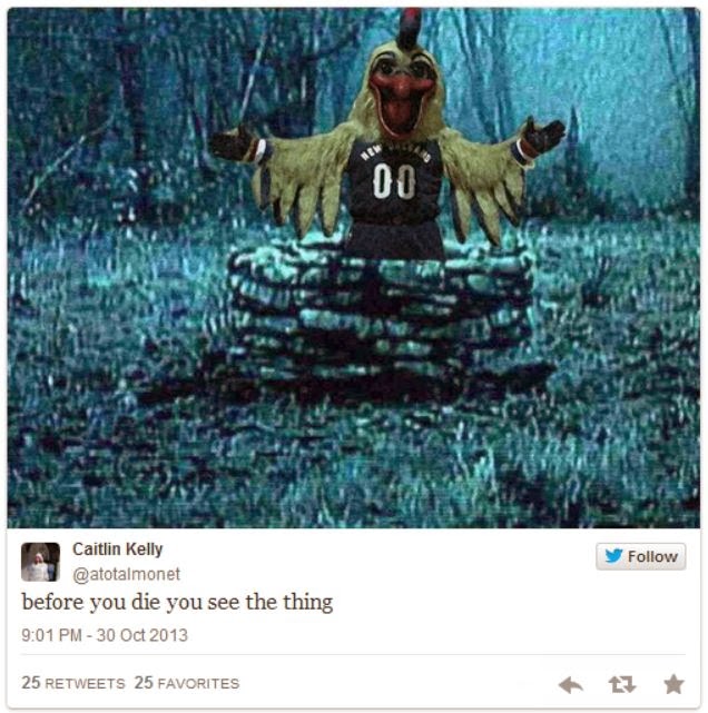
Pierre the Pelican. The most frightening sports mascot you will ever see (actually that might be false as I will prove later on). It's blood-red beak, luring tongue, unnaturally-yellowed feathers. If you did not dislike clowns before... Great job by the New Orleans Pelicans to take his debut picture as shown above in a pipe-filled back hallway where:


This "fowl" creation has been my most favorite social media fodder in recent memory. It gets so much better when fan's decide to challenge this horrified Tweeter's statement. I mean, take your pick:


 And then my favorite original and remix of all time:


The sheer terror shown by this child speaks to the reality of Pierre. It wants to eat children. It is in fact the boogeyman who lived under your bed when you were 5, except now you will think it is back because it is REAL. The New Orleans Hornets made an excellent redesign to become the Pelicans, I might add, as the bird symbolizes the rebirth of the wetland ecosystem that weathered Katrina and BP as well as the franchise that weathered the Chris Paul trade. Yet unfortunately the bird that rose again was a 7,000 year old Sumerian god of death here to consume the firstborn. Luckily, for the general populace of the United States and Louisiana, who I assume is used to Hoodoo magic (it's OK, I have a Cajun friend named Todd), Pierre saw a "plastic surgeon" about that nose as the basketball team presented in this video (really did not help make things less creepy). But here it is; a lot softer on the eyes and soul:
That's a lot better.


But, please continue.

Tuesday, February 18, 2014

Feed the Fans


I did not watch the NFL Pro Bowl this year. Nor did I watch the NBA All-Star game. Well, I did watch a few clips of the Celebrity Basketball Game just see if Kevin Hart said anything interesting, but that's beside the point. I had schoolwork and meetings and it just was not at all worth the time. From the minuscule opinion of a mortal fan such as myself, both events are over-hyped and under-delivered. As far as the Pro Bowl, the competition seems empty as no players want to get hurt for no legitimate reason other than a Hawaiian vacation. The All-Star game festivities, especially in pre-event promotion, way overshadow the actual event because most Americans would rather seen a spectacular star-studded dunk contest. However, that never ever happens these days due to whatever vague excuse used from luminaries such as King James, the Durantula, and Blake Griffin. Regardless of opinions on the peculiar rule change debuted at this years dunk contest, the event is just plain blah. Now that I have presented you with a wash of the general negativity of the matter, I want to seriously propose the greatest joint professional sport marketing event ever. All credit is due to Grantland staff writers for this fun and funny brainstorming session envisioning the best possible outcome of the decline of the all-star concept pro-level sporting event. I just want to help promote it.

Seriously, if the NFL and NBA created a joint Olympiad celebration, with all of their glitterati and glam, packed into 3 or 4 days, would you not watch it? Skills competitions on Wednesday and Thursday, rest on Friday, NBA on Saturday night, and NFL Sunday afternoon; it is perfect. Before we delve deeper, let us hash out the basic failing points of the current system:

  • Nothing is at stake. (which is, admittedly, both good and bad)
  • NBA superheros sometimes will not compete in fun competitions despite doing similar things on their own YouTube uploads and in commercials.
  • The NFL has a thrown-together skills challenge but it lacks the gravity of a potentially thrilling, but rarely fulfilling, Slam Dunk Contest.
  • Neither game is that competitive.
The first and last point can be both addressed quickly. If we want more competition, create a reward. The MLB All-Star game is rather well received and watched. The players actually care because the winning team, AL or NL, gets home field advantage for the World Series. I cannot think of something for the NFL right now, but there is room within the Draft and maybe the next-year's playoffs. The NBA could do the same as the MLB since they both have All-Star games midseason. If we do not want competitive play, to help prevent injuries, then make it more fun. Simply let players play whatever position they want!

Now to address the grand skills competition! Briefly these are a few possible events (some lifted from the Grantland feature): slam dunk contest, passing contest, shooting challenge, lineman basketball, celebrity football and basketball games, 3v3 basketball, 5v5 flag football, and the list goes on. If LeBron does not want to dunk, then let Megatron compete. Even better, how about a flag football team of Aaron Rodgers, LeBron James, Russell Westbrook, Marshawn Lynch, and Ndamukong Suh. Or watch Jared Allen get posted up by Vince Wilfork in the paint. I would love to see Steve Nash try his hand at football passing accuracy; he might not do well but it would be fun. Kevin Hart can participate in everything.

The viewer engagement would be miles beyond anything either organization has seen before. As, always fans will select the all-star teams on ESPN or through Twitter or Facebook. What if the NFL and NBA players selected their flag football teams themselves and then the fans voted for the starting match-ups within the bracket? The MVP's of every team-based event will be selected by viewer tweets. In fact, Twitter would have a field day with tweets penned solely to poke fun at large men playing a game that they probably should not be playing. The possibilities are virtually endless! Shaq could emcee every single event and serve as the Twitter curator-in-chief.

We can always hope. Maybe enough fans like myself will make similar pleas and the deep-pocketed men at the top of the sports entertainment pyramids will grant us plebians a beautiful wish.

Tuesday, February 11, 2014

My Reflection on a Nonprofit's Social Media


Rather than expound upon a current trend or evolving story within the realm of social media and our collective online conscious as this class-assignment-inspired-blog would dictate, I want to relate to my dear readers my experiences working with social media, digital marketing, and digital advertising in the best job I will never get paid for. That little phrase is how my coworkers and I colloquially refer to our organization and our positions within it but 'payment' is a subjective term here. There may be virtually no monetary compensation, except for a Starbucks, Jittery Joe's, or Chick-Fil-A gift card from a caring friend every now and then, but the missing wage is overly reimbursed by the overwhelming joy and fulfillment my job provides.

My "job" is a position serving on the Executive Board for a campus organization called UGA Miracle. UGA Miracle is a type of organization known around the country as Dance Marathon; we call ourselves something different but still end the year with an eponymous Dance Marathon event staged to celebrate the lives of children who have been able to overcome incredible odds in some capacity. As a fundraising, non-profit we donate all proceeds to Children's Healthcare of Atlanta. Specifically the division that UGA Miracle funds is the Comprehensive Inpatient Rehabilitation Unit, or CIRU for short, where children receive rehab treatments for motor difficulties, speech impairment, prosthesis use, and so forth. Our over 1000 members work individually and in teams to get donations for the hospital. As a UGA Miracle team member, you have the opportunity to apply for 11 committees that serve a different purpose in the day-to-day, monthly, and yearly operations of the organization.

I have been so fortunate to serve on the Board as Media Co-Chair for the past 2 years. I get to create and design the appearance of our social media accounts and of our advertising campaigns; the content of UGA Miracle's social presence is directed by the Public Relations Chair. I have even gotten to help re-brand the organization. Our social media presence is the most important means of uniting the organization. Our visual records reside primarily in the servers of Facebook and YouTube. The calendar most accessible to the whole organization is maintained by event pages on Facebook. Being a part in demonstrating to the world what it means to be FTK (For The Kids) visually and creatively, as is my passion, has brought me the most growth of any on-campus involvement. Naturally, I have littered this post with some of my work leading up to this years Dance Marathon.


While a brief description of UGA Miracle's purpose and formal institution is necessary, the ultimate purpose of this essay-of-sorts is to invite and convince you, the reader, to attend Dance Marathon 2014. Dance Marathon at the University of Georgia is the greatest 24 hours of your entire life starting at 10 AM on Saturday, February 22, 2014. Yes, I said 24 hours. It is 24 hours of chaotic, incessant fun in Tate Grand Hall where many kids who have been treated at Children's attend, with their families, the most fun party of their lives. For some of these children who still require semi-regular treatments, Dance Marathon is a humongous distraction from any illness or issue. It is a never-ending fairy tale of a adventure that both the children and the older children like me get completely and wonderfully lost in. All of the "Miracle Families" get to share their story of their experiences with Children's Healthcare of Atlanta with the entire crowd throughout the 24 hours. You get to participate in scavenger hunts across campus, watch the Accidentals and Noteworthy a cappella groups, win eating contests, witness a step show, give your all in a dance-off, and so on and so forth. Then, of course, there is the big dance. At DM, you get to learn a roughly 10 minute long dance along to a mash-up of some of your favorite songs. Every hour or so we learn one song-segments-worth until the final performance at 10 AM Sunday morning.

I could continue to ramble about the amenities and activities of Dance Marathon but the real joy comes from the time spent with the children. These kids have experienced far more difficult situations that most of us ever have. Despite histories of painful treatments, disabilities, or diseases, the heartwarming laughter and positivity of these kids is infectious. This will be my 4th and final undergraduate Dance Marathon. It is less than 2 weeks away and is my sole focus. right now We jokingly say "FTK is greater than GPA" but somehow that actually becomes the truth. As far as work experience, UGA Miracle has taught me how to perform as creative director of a brand and lead a committee of 36 students. As far as life experience, UGA Miracle has infinitely provided me a sense of gratitude with the health and circumstances that I have been blessed with. I spent a short time at Children's Healthcare of Atlanta in infancy but, by no means, did I ever experience the trials that some of the 'Miracle Kids" face. UGA Miracle is the greatest team that I have ever been a part of. The mere fact that a very large group of college kids can unite under the idea of helping to save children's lives is the one of the greatest satisfactions of being involved in this organization. $25,000 is an average number for what it costs to save a child's life. However, $30 might save a life and so could $70,000. Every single dollar counts and, therefore, so does every single member of UGA Miracle. The most humbling feature of Children's is that, because of donors such as UGA Miracle, the Atlanta Falcons, Home Depot, Wal-Mart, and others, the hospital will not deny care to a family that cannot afford it. If a family cannot pay the bills, then essentially we do. I will be forever grateful for the friends and fun that being involved in UGA Miracle has given me. Watch the video I attached above and then watch it again. Watch this and this and this (just a few of my favorites). Please join us on February 22 and 23 for the best 24 hours of your life.

Here is a link to the event: Dance Marathon 2014

Also if you would like to donate to my total I would be extremely appreciative. Thank you!
Donor Drive